Where a field can only be populated from a selection of predetermined options it is usual to present the user with some sort of picklist. This shows the user what options are actually available so that he can more easily make a choice. The alternative is to allow the user to manually input a value, which can be tricky if he doesn't know the contents of the list.
UNIFACE provides several standard widgets for presenting the user with a picklist, and these make use of associative lists. These are strings that can hold multiple items of data in what are known VALREP pairs. Each pair takes the form of value=representation, and one pair is separated from another by the standard delimiter of GOLD semicolon, which for documentation purposes is shown as an underlined semicolon ( ; ). An example of an associative list would be:
"A=Monday;B=Tuesday;C=Wednesday;D=Thursday;E=Friday;F=Saturday;G=Sunday"
When the list is shown to the user he sees just the representations, but when he makes a choice it is the value part that is actually assigned to the field and stored in the database. This has two distinct advantages:
value held in the field is smaller than the associated representation, thus saving space.representations translated into other languages. This would not affect any checking of the values in any program code as they would remain the same.An associative list can be loaded into a widget with the command $valrep(field) = list which will load the list into the specified field in all occurrences within the current component. Alternatively the $fieldvalrep command can be used to load the list into the current occurrence only.
To use a dropdownlist for a field you must do the following:
DropDownList.value.representation, as shown in figure 1.| Figure 1 |
|---|
|
|
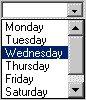
When the component is displayed the field will be empty unless a value has already been assigned, in which case the associated representation will be shown. It is possible to exclude the down arrow from the end of the field until the field gains focus by setting the 'dynamic' property to 'off'. When the field gains focus a list of options will appear immediately below it, as shown in figure 2.
| Figure 2 |
|---|
|
The depth of this list can be set in the field's properties as 'number of choices'. If the number of options overflows the depth of the list then a scroll bar will be included. The user selects an option by clicking on it with the mouse, or by use of the 'up' or 'down' arrows on the keyboard. The selected option appears in the field itself and is highlighted in the list. Note that the field can only contain a single value, therefore any new selection replaces the previous selection.
The user cannot add new items to the list. Entering a character in the field starts a 'speed search' for an item that starts with the same letter as the user entered; that is, UNIFACE scrolls the list to the next item that starts with that letter.
This has one major difference with the DropDownList - it provides the ability to make multiple, not single selections. To implement this feature you must do the following:
ListBox.value plus all the 'GOLD;' delimiters.REP(0-n) where 'n' is the total number of entries in the list. To make the field mandatory use REP(1-n) instead.| Figure 3 |
|---|

|
Using the list of day names as an example, if all options were selected the field would need to contain the string "A;B;C;D;E;F;G" and would therefore need the size to be not less than 13 characters. The syntax definition would need to be REP(0-7)which would allow the field to hold 0-7 repetitions (selections). If you do not allow any repetitions then only a single selection can be made, in which case you would be better off using a DropDownList.
Note1: The field interface of C13 and syntax of REP(0-7) will hold variable length substrings separated by 'GOLD;'. If you change the interface to be VC13 this will not store trailing spaces.
Note2: The field interface of C1(7) will hold fixed length substrings which are not separated by 'GOLD;'. This specifies a fixed length substring of (1) in a field of total length (7). Note that the substring length must be large enough to hold the largest value. Field syntax can be set to mandatory or not, but REP(0-7) will not be required. If you change the interface to be VC1(7) this will not store trailing spaces.
When the component is displayed the field will show all the possible representations with all selected items highlighted, as shown in figure 4.
| Figure 4 |
|---|

|
The depth of this list will always be as defined in the graphical form painter. If the number of options overflows the depth of the list then a scroll bar will be included. The user selects or deselects an option by clicking on it with the mouse in a toggling action. If it is selected it is highlighted, if it is deselected the highlighting is removed.
The simple toggling action for selecting and deselecting entries in the list is the default behaviour for the ListBox widget, but Ulrich Merkel has provided the following information in a recent newsgroup posting:
In the widget's properties press the MORE button. In the 'Widget Parameter' area type 'EXTENDEDSEL', and in the 'Value' area type 'ON'. This allows the selection method to be more like the File Explorer in Windows:
If this mechanism is not included in any official UNIFACE documentation it must be regarded as an unsupported feature.
Tony Marston
11th March 2001
mailto:tony@tonymarston.net
mailto:TonyMarston@hotmail.com
http://www.tonymarston.net